A Ramble on Designing the Learning Icon™ Graphics
In their book, Pictograms, Icons &Signs – A guide to information graphics Abdullah and Hubner offer a graphical formula to the design of pictograms for information that meets my “lay-person’s” opinion developing over some years of using such devices and the need of my current project.
Although they describe their graphic signs as pictograms, I am satisfied that the flexibility of the Learning Icon™ concept allows for the use of pictograms, icons, thumbnails, videos, or whatever else one might choose to represent the information of learning opportunity contained within (if acting as a Learning Object) or linked to (if more an action-on device).
Technology and graphic-editing-suite experience will affect the quality and design of graphics, and the personal choice of graphic suite will affect the interoperability of designs between designers, clients, and learners alike. For this reason, and to avoid bogging down in the detail within this project the following design procedure is employed using Microsoft Office products, which are accessible across the client organisation:
- Icon Design Matrix. This MS Word document contains a table with design notes for each icon required (extracted from the existing texts) and prototypes sketched in my favourite graphic suite and imported as small JPEG files.
- PowerPoint Icon Design Space. This MS PowerPoint slide allows the prototype pictograms to be developed individually while using common graphical parts to make up the required symbols. It is not important to save each step as Step 3 (below) calls for the transfer of the finished design to its own slide show.
- Individual Icon Space. Each icon drafted in the PowerPoint Icon Design Space is copied and pasted into its own slide show. Here, it is manipulated into its first-stage prototype of the 3D-style card or paper Learning Icon™, which doubles as the repository for the graphic. The PowerPoint icon is copied and pasted as a PNG format image, which is far more scalable than PowerPoint graphics once they contain line thicknesses and fonts!
- BCD Prototype. The finished PNG graphics are shoe-horned into the prototype BCD Aide Memoir drawn straight from the extant text-box-based version (Jan 07). (This process originally omitted the PNG format and the time taken to reduce the scale of the PowerPoint graphics was burdensome – this element of the process has therefore been delayed).
 Product Prototypes. Although not essential to the project, for some light relief a number of product prototypes are being developed (such as the 3d-style Learning Icon™). These are only tinsel, but serve to demonstrate the Learning Icon™ as being a far wider strategy than to be only a graphical learning device on a screen. (See the Conceptual Model – link open in a new window).


.jpg)


Abdullah and Hubner detail some useful design formatting guidance for the creation of pictographic signs. These include the standardisation of size, line width, colour-coding, etc. It also includes a process of determining the sign’s (in the broadest semiotic sense) intended function. This is in-line with the process I have developed from other references meeting a little trial and error. However, their format is concise, meets the needs of this project’s prototype Learning Icons™, and fits in a smaller space than the journey toward discovery my dissertation gives to the subject of getting the message right.
Should I cut my dissertation text? No. The process is important enough to qualify as essential to the development of a Learning Icon™. There’s little point in determining to design a set of icons to find later that they are undecipherable to the clients!
Pertinently, I have already drafted a passage or two on the need to instantly recognise some signs but that others may need to be learned with no detrimental effect to the client. I subjected my wife to the (poorly-designed, I feel) “Baby Nurse” pictogram illustrated in this blog at Semantics of icons & pictograms. I’ve repeated it below for ease of reference.
 Anyway, my wife was shown the icon without any reference and announced it was someone (possibly a nurse) with a broken arm. When I showed her the accompanying sign for babies, she pretty quickly corrected her guess to being “someone with a baby – it must be a baby nurse”. A day later, after a torrid day at work, my wife came home to the same icon being shoved in front of her nose. “What was this?” I demanded. “The bloody baby nurse, now let me get in!”

Okay; not the most scientific primary research, I’ll grant you, but it shows me that the “burden” discussed between my friends and I (and in my references) on the learner having to learn a new sign is only small. Skill fade, or a lack of familiarity may impede but a short text label should jar the memory should it lapse?
Consider road traffic signs, the Highway Code, and your driving test - sorry if that brings back bad memories but, hey, that's science for you. You probably zip about the national road network subconsciously deciphering signs such as "uneven road surface" (that should be double humped bridge), "wild animals on the road", and "level crossing with a gate ahead". These are not straight forward signs until they are learned. Part of the theory test is to demonstrate your knowledge of these signs significance. It doesn't make you a bad driver; it makes you a better one. Loose arguments, but it's late and I'm sure you're intelligent enough to work out where I am going with this yourselves.
Actually, here’s where Abdullah and Hubner and I part, or the Learning Icon™ demonstrates that it really is a unique application in colliding worlds brought together by developing learning theory and technology. They claim a pictogram should not be accompanied by words: that it should be well enough designed to be instantly decoded by the observer (yeah, “baby nurse”). What they fail to discuss fully is that their examples need to be learned: that the language of symbols is not a natural one, though they do mention "symbol dyslexia". However, why kick the messenger; if a text label will assist the learner with recognising the meaning of the Learning Icon™ why not let it?
On "symbol dyslexia", it reminds me of a piece of on-the-spot-research conducted for my 1st Year. Two friends of mine with different forms of diagnosed dyslexia examined my embryonic ideas of Learning Icons™ and disappointed me in their declaration, "it's the white space, Pat.
It wasn’t “symbol dyslexia” but the white space between them that caused some difficulty. Learning Differences must be addressed (not necessarily within the body of my report) but I owe my colleagues the investigation of whether learning differences need result in greater care in the icons’ design – especially as I have adopted the use of text in them following earlier research to involve the client group with their design.
Participants were offered a choice of 2 icon designs for common and not-so-common concepts from the project trauma topic. For example, a symbol developed to denote “Airway”, or the letter “A”. Almost without question the group sample of 25 opted for the “A” as is convention. Similarly “BLS”, “BCD”, “CUF”, etc. (Don’t worry what they are, they’re just further examples of the preference for letters in the symbols).

This avoidance of learning differneces aside, Abdullah and Hubner's design guidance is comprehensive. Here’s a synopsis toward how I will modify my similar approach to meet what is obviously a clever employment of simple principles (remembering these are for their idea of pictograms such as “No Smoking” and road traffic or safety signs):
- Conception: list the themes to be designated
- Directions
- Warning
- Request
- Ban
- I would add “learning” here
- Design:
- Overall format (for Learning Icons™; icon, thumbnail, video, animation, etc?)
- The bearer (the screen, or folding card for classroom work, or an item of equipment)
- Design grid: relationships between angles, shapes, and space
- Line thickness: Narrow ½ unit, Standard 1 unit, Thick 2 units
- Colours to be used and how they are to be used
- Shape selection (possibly according to aesthetic or existing syntax – warning triangles, etc.
- Cultural neutrality
- Lettering
- Abstraction: reducing the ideal idea into its simplest but most easily recognisable form to give maximum impact
- Pictorial rhythm and balance: straight and parallel lines may be mathematically correct but aesthetically out of balance. This can cause a distraction.

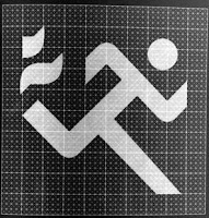
- Pictorial language: what is in use already, what conventions exist, what needs to be new?


Added to this, I think they allude to it, is the overall consistency of the designs between related icons (those employed with one another). Consistency assists cognition, of course.
Once the symbology has been decided and the field (background) on which it sits has been determined the icon should come together. An earlier illustration of what I believed an icon should be is to the left. I don’t think it to be more than 1mm away from the descriptions of Abdullah and Hubner, and remains the conceptual design key of my project Learning Icons™.

Abdullah and Hubner also include a useful insight into building graphical symbols from lines and circles. This is a technique I have used on a number of occasions and it is again good to see that where I lack formal training I enjoyed a great deal of quality art tuition during my schooling and the company of an exceptionally creative family group.
Summary
Again, the usefulness of this book find has been immeasurable and well-timed. If I had found it earlier then I would undoubtedly missed out on, or skimmed over a depth of knowledge about the graphical design of icons (and pictograms) toward developing effective Learning Icons™ to test. What good would icons like the "Baby Nurse" above be where I am to measure learning? This is no mean feat in it's self, so distraction of my learners through bad design could be a disaster. Similarly, if the Learning Icon™ is to take off within my organisation for the routine delivery of BCD, then the project needs to look the part - to look and prove to be effective.
I make no apology then, in this my MSc project toward eLearning, that I have delved into and trawled the world of semiotics and graphic design. E-Learning is very visual in its approach, especially that delivered by Internet and CD/DVD-ROM, etc. What good is page turning on a screen when there can be an alternative to bulky texts in one layer, or another - deeper one? For page turning, see the BCD instructor resource (pilot e-Learning example) at the link. In fairness, this has been modified of late and is beginning to appear much more of a benefit to learning than it did on my first preview. The page screenshot below shows that visualization of fracture images helps in the recognition of broken bones on a casualty.

As it stands at the moment, I am using Learning Icons™ on the upper level of the learning design from which learners delve into a larger Learning Object. With care in design and a slight cultural change, why mightn’t the icons go deeper to new levels? Why use text?
The image below is a mock-up of implementing the Learning Icons™ (in their simplest "dumb" form) within the same eLearning package. There is still a bulk of text, which can be reduced using video, animations, Learning Icons™, or other visualization technique.

More on icons replacing text later...
....


