 According to Abdullah and Hubner (Pictograms, Icons, and Signs) the Learning Icon™ is not necessarily an icon at all. In fact, their descriptions of a pictogram are probably more in keeping with my current designs being tested for this study. (Book cover from Amazon).
Both icons and pictograms can form signs, however, and that seems to be the important bit so not all is lost! Beside which, depending on what takes the designers fancy with the Learning Icon™ and its mode of operation, I’m sure it will cross all boundaries as seen fit.
There are commonalities in their design but their definitions vary. Icons are described to be almost whimsical in nature (like ‘emoticons’ in MS Messenger) while pictograms impart information in the serious way of the road-traffic or hospital department sign.
Pictograms
Abdullah and Hubner use the Collins Dictionary definition of pictograms: “another word for a pictograph”, which is, “a picture or symbol standing for a group of words…” Herbert Kapitzki (Prof Visual Communications at the University of Arts, Berlin) is referred to as going further, “A pictogram is an iconic sign that depicts the character of what is being represented and through abstraction takes on its quality as a sign.” This meets my interpretation, if I am honest. Kapitzki sub-categorises pictograms as:
- Iconogram: “An iconic sign, which as an illustrative representation emphasise the points in common between the signifier and the signified”.
- Pictogram: ”An iconic sign that represents complex facts, not through words or sounds but through visual carriers of meaning”.
- Ideogram: “Corresponds to the sign as a symbol, which relates to the object or concept referred to independently of any formal identification with it”. (Apple Mac’s apple logo is used – it’s an apple but means the computer company and its name, “apple computers”.
- Logogram: “Conceptual representation like writing. A visual referential linguistic sign that does not take the phonetic dimension into consideration”. The use the AEG logo.
- Typogram: This is suptly different to the Logogram. “Typographical representation. A sign, also a composed sign, derived froma written repetoiur such as the alphabet”. Think of the camera and photocopying giants, “Canon”.
He also lists, “Cartogram” (topographical device), “Diagram” (you guessed it, but he makes it sound complicated), and “Phonogram” (signifies sounds like a whistle).
Poor Examples
Just as you believe Kapitzki to be a sensible bloke Abdullah and Hubner include a section of his pictograms for use in health and social services. Check these out and comment whether you feel them to be a great as I do:

Is this a sign for us to see the black nurse nursing a broken arm? No, it’s to signify a baby nurse (a nurse of babies). “Oh, yeah.” You declare…
A couple or three points:
- She’s a “she” (tight uniform that emphases the breasts and a girle-nursie hat). That’s just so out of date now. In fact, it doesn’t meet the University of Portsmouth’s equality guidelines and it makes my girle-nursie wife laught, too. Tch.
- You need to recognise the sign for babies before you can work this out.
- Once you know what it is it becomes more "obvious"
It is encouraging that even a poorly conceived or illustrated sign can be learned and then become useful. Many poorer signs are placed (uselessly in some cases) beside long descriptions of text.
The next image (No. 27) is a star. As a clinical person I worked it out from my experience of anatomy and physiology of the ear, and some good luck. Actually, I had to read it in the book text. What’s it signify?

Ear, nose, and throat. Hmm. Sometimes the slavery to a style is a barrier to meaning, I say!
 I like these two. The top one (No. 20) is obviously the place where magicians perform levitation sketches and (No. 23) is the doctor’s special place for assaulting their patients.
And, finally. Of course the person depicted on the left (No. 9) is a doctor and the one on the right (No.10), a nurse.  I mentioned before how icons can go out of date? Well, here’s a prime example of sexism that used to be logical deduction. You younger women don’t know how grim it really used to be. Anyway, enough Kapitzki-bashing.
And, just because it's funny (thanks, Nick) here we are returning to toilet humour with a Swiss toilet sign. Culturally challenging? Perhaps in some places this would be funny. In a Mosque or Church...probaly enough to start a fight.

Colour Meaning in Pictograms
We know colouring is affected by culture and syntax of meaning, but where I am currently using the following colours in my Battlefield Casualty Drills prototype others may use them differently.
- Red – danger or extreme hazard
- Amber – caution, there may be a danger
- Blue – standard instruction or event / equipment
- Green – direction of flow in an algorithm, including start points
Originally I had planned to utilise colour backgrounds (I call them fields) to denote the varying elements of the medical subject: airway, breathing, circulation, etc. The problem quickly arose, however, that I needed more colours than I could reliably claim to be correctly perceived by all my clients: some of whom are colour-blind to some degree. I chose colours that, when rendered as greyscale, still showed contrast between them and I also elected to de-emphasise the importance of their colour,; the meaning of their symbols being the primary indicator of where they may sit in the order of things. Ontological order is indicated by the vertical space on the page layouts as most of the information is formed in algorithms that run down the page as with a gravity.
.jpg)
Coincidentally, this layout of hierarchy raises a cultural problem: up to down, left to right. Not everyone writes in these ways. I discounted the issue for now as the majority of the clients are English-aware, Western culture-based, or otherwise familiar with the chosen domestic syntax. Back to colours and icon design.
Examples of regularly used colours
 British motorway signs have a blue field with white symbols infont. In Cyprus they are green with white while primary routes have the blue and white mix. The photograph below shows a Cypriot primary route sign. Interestingly, the colour used for sites of touristy interest are brown as they are in the UK. Cyprus was a British colony until the 1960s and still hosts two British Sovereign Base Areas and a large number of British Ex-pats (ergo, the bilingual element), so I would have expected the signs to bare British rather than Greek codes?
It seems that colour variance of meaning is both standard (stop signs all over the World are red) and local (the road signs described above). It must be difficult to get a World standard then, where the adaptation of a colour scheme perceived to derive from the West may not sit well with many countries away to the East, who have their own colour cultures and may take unkindly to having Western values imposed upon them.
That being said, I recall road signs in Saudi Arabia, Thailand, and Canada to follow the white with black, green with white, and blue with white themes. Each of the airports employed yellow and black icons on their signs. In India the signs seemed to follow local dialects. Hey! Variety is the spice of life, don’t you know, but perhaps we can roam toward a common standard after all?
The Berlin Transport Services use the following colour coding
- White on blue field = disabled facilities.
- Black on yellow field = denote general directions (like airports).
- White on red field = symbol of measures to counter dangers (e.g., fire extinguisher).
- White on green field = denotes protection from danger, like running away through doors (fire exits).
- White on dark-grey field = denoting companies.
In a learning software, I don’t think it matters too much about what colours are used as long as it’s consistent throughout each software, though they should fit in with the cultural perceptions of the intended audience.
The same goes for shape. Most of those described by Abdullah and Hubner are square or circular. It all seems very formal – similar to the icons I have already demonstrated in my BCD work, which needed to demonstrate some formality for their bredth of deployment and to meet the needs of the organisation for which they were intended. They also match the formality of the style of pictogram or icon used across the health services. I think, again, this is where the Learning Icon™ and Learning Object trades with icons, pictograms, pictographs, and other visualizations in that there are great graphic freedoms for designers, but the client will most likely want something that goes with the flow.
Particularly encouraging parts of the Abdullah and Hubner saga is their acknowledgment that visualizations can:
- Replace text
- Include text
- Impart meaning rapidly
- Be easily learned if new to the user
- Be useful cross-culturally (Berlin needed icons / pictograms on the transport system to accommodate the 160 different nationalities living there)
- Have design rules (more later)
The book also outlines the previously surmised conclusion that icons can change meaning according to context or text, which Abdullah and Hubner describe as their environment. A "NO ENTRY" sign on a long wall or illustrated within a book does not have the same meaning as one posted on a gate or at the beginning of a route. In fact, the physical environment becomes a part of the overall semiotics of the sign.
Sequencing
My findings regarding the sequencing of images into enlarged meaning have been pretty solid. The book not only confirms this in the case of their icon definition, but also within the sign its self: symbols arranged sequentially to impart a concise meaning like name hieroglyphs in ancient Egyptian texts.
The example of a safety sign below is from www.hendersonsigns.co.uk. It combines a symbol of a person with those of a fire and a direction arrow - all in the same pictogram. This opens a great deal of opportunity to sequence icons as well as the symbols within them allowing for a far wider scope in their meaning and possibly the learning opportunities they might attend to.

Summary
Although I found this book late in the project I’m glad I did. It now amplifies what I have already discovered about icons and signs and formalises my thoughts toward their use as being ‘do-able’. The really neat bit is that it is full of crap icons, which is very encouraging for a novice designer like me that people pay for such poorly executed iconographic solutions.
- Colour choice can be doctrinal but do not have to be dogma.
- An icon (pictogram) graphic format is available to apply to the Learning Icons™ being developed for this particular project.
- Even poorly composed, conceived, or designed icons can become recognisable / useful
- Icon decoding can be environmentally dependent.
Couldn't resist this! ;)
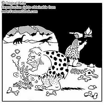 From www.cartoonstock.com (click the image for the link).
Icons and Grammar
more to follow soon…


