Showing posts with label semiotics. Show all posts

Saturday, 9 February 2008

Disertation Extracts

Disertation Extract


This page offers the abstract and conclusions of "The Learning Icon™ - Developing a hybrid eLearning visualization strategy", a disertation for the Masters Degree in Electronic Learning Technologies at the Universty of Portsmouth by Pat Godfrey, November 2007. References are offered under a separate post.


Abstract


The measurement of textual literacy as a measure of learning success disenfranchises visual learners and those with cultural or cognitive learning differences. Visual literacy is developing in our society while textual expertise is diminishing.


Visualization is a mature learning strategy that allows for maintaining interest, rapid cognition, and efficient memory processing across language and culture. The Learning Icon™ strategy proposes to exploit the visual interface between screen and learner; a flexible graphic user interface (GUI) strategy that embraces visualization and learning object technologies.


The study includes exploration of graphic and user-interface design principles, learning strategies, and existing visualization lore to provide a stepping stone for eLearning developers to consider for the 21st Century learner. A simple Learning Icon™ format is tested within a small military learner group to prove whether a text-based teaching strategy can be adapted to an iconic form and determine what advantages this may present.


Conclusions


This study bridged a gap between the discussion of learning objects, icons, and visualization toward imparting an improved and more effective learning experience to the diversity of learners of the Defence Medical Services (DMS), and to a broader spectrum of learners across the eLearning World.


The technology and practice of learning objects is no longer emergent but still lacks concise definitions or standards (Morrison, 2003). Existing standards have poor access outside English-speaking commercial eLearning and little value to small, ad-hoc, or local eLearning programmes that do not need, or cannot afford reusability or Learning Management Systems (UserFocus, 2007). This bodes badly for additional strategies for packaging learning within learning objects: if the popular learning object is not yet “right” and remains the focus of standards groups, what chance has
a bespoke visual vehicle such as an icon for imparting learning got? To develop a standard would involve the mitigation of countless others for icon design, colour , meta-data, usability, SCORM compliance, etc., all right and proper to ensure a wide and safe market, but they could turn out to be just too much bother.


Yet, the weight of evidence for visualization to be used in learning is overwhelming and its employment in place of selected texts proven to affect the speed with which learners of mixed ability process information as described by Bhattacharya, (2006), and in this study’s rudimentary assessment of the difference. If this speed of recognition, discrimination,and processing alludes to the reason visualisations create an ease of learning, if a picture paints a thousand words, then perhaps the strategy should be examined more closely in cohort with other eLearning strategies, not separately to them as seems the case in the literature review where each essential component of a bespoke strategy had to draw on multiple
papers just to determine how an icon should be presented, never mind what multimedia and interactive engagement opportunities it might contain.


As for the replacing of selected texts in learning presentation, again there is overwhelming evidence that visualization should assist text to develop understanding of the content conveyed (Technical Advisory Service for Images, 2006, Abdelhamid ,1999, Clark, 2003, and Jewitt, Kress, Jogborn and Tsatsarelis, 2001). This study proved (albeit with a limited population)that the time to complete a simple recognition task was cut in half by changing quite simple text statements for effectively designed icons. Additionally, sterling work such as that organised by Widget Software (2007) to involve learners who have learning, cognitive, and physical
differences is storming ahead in the field of visualization – why? Because it makes some things easier to learn for those who find traditional learning regimens difficult. We are naturally visual whether it is our strongest learning preference, or not. The intellectual snobbery of text-based skills over visual ones (Erickson, 2007) is almost laughable when the age of text, which is a visualisation strategy, is far exceeded by pictograms (Cheyne, 2007).


Given the wide scope of what is involved in producing visualizations, icons and pictograms (Abdullah & Hubner, 2007), or a simple Learning Icon™ strategy with its implementation of learning objects and their standards (Morrison, 2003, and Wiley, 2006), the design, production and coordination of multimedia, the instructional design and the learner’s control of it (Magoulas, Papanikolaou, & Grigoriadou, 2003) – perhaps visualization should take its place alongside text as being every bit as difficult to employ properly and every bit as complex in its symbology, grammar, and literacy.


The 50% of recruits, according to Defence Education and Training Services (Army), 2006), joining the Services with a reading ability less than that expected of an 11-year-old are going to require help in their learning, rehearsal, and application of their skills, which are becoming ever the more essential to our security. Their literacy skills can be enabled to Basic levels, but still their literacy training cannot meet the expectancy of the bright people that graduate through the traditional education system and design their learning. Not every 16-17-year-old joins the Services, either, and not all of them look, speak, or pray in the same language. There are many poor-achieving learners in the UK who might benefit a more visualimage approach to eLearning; a wide market. Perhaps profit can drive forward a strategy that meets the needs of the low-achieving learner? The resulting increases in skills recruitment to industry, even?


Learners can be disadvantaged by text-based learning (Horton, 1995, in Haramundanis, 1996) or their differences of languages and culture, which don’t need to be geographically vast to become a barrier to learning (Holderness, 2007, Minton, 2002, and Lefrancois, 2003). Where we are beginning to understand learning differences as well as learning preferences, where an equal opportunity should be offered to all, and where uptake of Service eLearning is forecast (Defence Training Review 2002), perhaps the measurement of text literacy as a marker to intelligence
and ability (as described by Kimbro, 2005) should stop and make way for the literacy of choice and of communication that works.


The DMS and the wider Services needs competent practitioners, not literary geniuses. A visualization strategy such as the flexible vision of the Learning Icon™ that complements text and offers all the benefits of learning objects as well as an ability to produce effective learning using common mediums such as PowerPoint®, for example, and which may better engage learners than do simple GUI buttons, might offer a solution.


And if the proof of learning isn’t strong enough? The BCD aide memoir is designed to be read by all soldiers; the language tone and colour of the text-boxes has been carefully designed for rapid processing to enable the speedy care of the wounded on the battlefield. A simple test of speed in the recognition of icons over these same text-boxes, acknowledged to have been conducted with too small a sample, was overwhelming found in favour of icon with soldiers. If speed of processing between sensory and shortterm memory indicates a potential to increase the potential to learn, and concise visualization improves learning opportunities over, or alongside text in eLearning, then the thesis is near proven. Within the Defence Medical Services eLearning programmes, Learning Icons™ can replace selected texts to improve the learning of its diverse learners. If not irrefutable, then perhaps investment needs made to make it so?


There really is so much more to be explored.


How to reference


Godfrey, P., (2007), "The Learning Icon™ - Developing a hybrid eLearning visualization strategy", Universty of Portsmouth.


Grateful thanks to:


    • Prof. Peter Roberts: Inspiration to get on.
    • Dr David Morgan-Jones for his enthusiasm and the opportunities ignited from it.
    • Dr Frank Strange: “have you heard of Saussure?”
    • Mrs Pricilla Rae and Dr David Holloway, University of Portsmouth: diligent, progressive, and positive.
    • All of my tutors at University of Portsmouth, especially Terry King, and Emma Duke-Williams (who eachl marked the project ☺).
    • Mr Linton Greatwood, Technical Author DMETA 2007.
    • 4 General Support Medical Regiment 2007: loans of guinea pigs.
    • LIMMs 2007: the belligerent, "bull-in-a-china-shop" sceptics I needed - sometimes.
    • Mr Nick Webb: an ever-ready ear.
    • My 3Ks: time.

Saturday, 11 August 2007

Semantics of Icons and Pictograms

Abdullah and Hubner book cover (from amazon.co.ukAccording to Abdullah and Hubner (Pictograms, Icons, and Signs) the Learning Icon™ is not necessarily an icon at all. In fact, their descriptions of a pictogram are probably more in keeping with my current designs being tested for this study. (Book cover from Amazon).


Both icons and pictograms can form signs, however, and that seems to be the important bit so not all is lost! Beside which, depending on what takes the designers fancy with the Learning Icon™ and its mode of operation, I’m sure it will cross all boundaries as seen fit.


There are commonalities in their design but their definitions vary. Icons are described to be almost whimsical in nature (like ‘emoticons’ in MS Messenger) while pictograms impart information in the serious way of the road-traffic or hospital department sign.


Pictograms


Abdullah and Hubner use the Collins Dictionary definition of pictograms: “another word for a pictograph”, which is, “a picture or symbol standing for a group of words…” Herbert Kapitzki (Prof Visual Communications at the University of Arts, Berlin) is referred to as going further, “A pictogram is an iconic sign that depicts the character of what is being represented and through abstraction takes on its quality as a sign.” This meets my interpretation, if I am honest. Kapitzki sub-categorises pictograms as:

  • Iconogram: “An iconic sign, which as an illustrative representation emphasise the points in common between the signifier and the signified”.

  • Pictogram: ”An iconic sign that represents complex facts, not through words or sounds but through visual carriers of meaning”.

  • Ideogram: “Corresponds to the sign as a symbol, which relates to the object or concept referred to independently of any formal identification with it”. (Apple Mac’s apple logo is used – it’s an apple but means the computer company and its name, “apple computers”.

  • Logogram: “Conceptual representation like writing. A visual referential linguistic sign that does not take the phonetic dimension into consideration”. The use the AEG logo.

  • Typogram: This is suptly different to the Logogram. “Typographical representation. A sign, also a composed sign, derived froma written repetoiur such as the alphabet”. Think of the camera and photocopying giants, “Canon”.

He also lists, “Cartogram” (topographical device), “Diagram” (you guessed it, but he makes it sound complicated), and “Phonogram” (signifies sounds like a whistle).


Poor Examples


Just as you believe Kapitzki to be a sensible bloke Abdullah and Hubner include a section of his pictograms for use in health and social services. Check these out and comment whether you feel them to be a great as I do:


Improbable representation of a baby nurse

Is this a sign for us to see the black nurse nursing a broken arm? No, it’s to signify a baby nurse (a nurse of babies). “Oh, yeah.” You declare…


A couple or three points:

  1. She’s a “she” (tight uniform that emphases the breasts and a girle-nursie hat). That’s just so out of date now. In fact, it doesn’t meet the University of Portsmouth’s equality guidelines and it makes my girle-nursie wife laught, too. Tch.

  2. You need to recognise the sign for babies before you can work this out.

  3. Once you know what it is it becomes more "obvious"

It is encouraging that even a poorly conceived or illustrated sign can be learned and then become useful. Many poorer signs are placed (uselessly in some cases) beside long descriptions of text.


The next image (No. 27) is a star. As a clinical person I worked it out from my experience of anatomy and physiology of the ear, and some good luck. Actually, I had to read it in the book text. What’s it signify?


Poor representation for ENT (Ear, Nose, and Throat department

Ear, nose, and throat. Hmm. Sometimes the slavery to a style is a barrier to meaning, I say!


Image of two icons or pictograms with a humourously ambiguous meaningI like these two. The top one (No. 20) is obviously the place where magicians perform levitation sketches and (No. 23) is the doctor’s special place for assaulting their patients.


And, finally. Of course the person depicted on the left (No. 9) is a doctor and the one on the right (No.10), a nurse. Now sexist representations of a doctor and his nurseI mentioned before how icons can go out of date? Well, here’s a prime example of sexism that used to be logical deduction. You younger women don’t know how grim it really used to be. Anyway, enough Kapitzki-bashing.


And, just because it's funny (thanks, Nick) here we are returning to toilet humour with a Swiss toilet sign. Culturally challenging? Perhaps in some places this would be funny. In a Mosque or Church...probaly enough to start a fight.


Colour Meaning in Pictograms


We know colouring is affected by culture and syntax of meaning, but where I am currently using the following colours in my Battlefield Casualty Drills prototype others may use them differently.

  • Red – danger or extreme hazard

  • Amber – caution, there may be a danger

  • Blue – standard instruction or event / equipment

  • Green – direction of flow in an algorithm, including start points


Originally I had planned to utilise colour backgrounds (I call them fields) to denote the varying elements of the medical subject: airway, breathing, circulation, etc. The problem quickly arose, however, that I needed more colours than I could reliably claim to be correctly perceived by all my clients: some of whom are colour-blind to some degree. I chose colours that, when rendered as greyscale, still showed contrast between them and I also elected to de-emphasise the importance of their colour,; the meaning of their symbols being the primary indicator of where they may sit in the order of things. Ontological order is indicated by the vertical space on the page layouts as most of the information is formed in algorithms that run down the page as with a gravity.


Example screenshot of the project PowerPoint-based prototype

Coincidentally, this layout of hierarchy raises a cultural problem: up to down, left to right. Not everyone writes in these ways. I discounted the issue for now as the majority of the clients are English-aware, Western culture-based, or otherwise familiar with the chosen domestic syntax. Back to colours and icon design.


Examples of regularly used colours


Image of regularly used colours to indicate specific meaningsBritish motorway signs have a blue field with white symbols infont. In Cyprus they are green with white while primary routes have the blue and white mix. The photograph below shows a Cypriot primary route sign. Interestingly, the colour used for sites of touristy interest are brown as they are in the UK. Cyprus was a British colony until the 1960s and still hosts two British Sovereign Base Areas and a large number of British Ex-pats (ergo, the bilingual element), so I would have expected the signs to bare British rather than Greek codes?


Cyprus Road Sign

It seems that colour variance of meaning is both standard (stop signs all over the World are red) and local (the road signs described above). It must be difficult to get a World standard then, where the adaptation of a colour scheme perceived to derive from the West may not sit well with many countries away to the East, who have their own colour cultures and may take unkindly to having Western values imposed upon them.


That being said, I recall road signs in Saudi Arabia, Thailand, and Canada to follow the white with black, green with white, and blue with white themes. Each of the airports employed yellow and black icons on their signs. In India the signs seemed to follow local dialects. Hey! Variety is the spice of life, don’t you know, but perhaps we can roam toward a common standard after all?


The Berlin Transport Services use the following colour coding

  • White on blue field = disabled facilities.

  • Black on yellow field = denote general directions (like airports).

  • White on red field = symbol of measures to counter dangers (e.g., fire extinguisher).

  • White on green field = denotes protection from danger, like running away through doors (fire exits).

  • White on dark-grey field = denoting companies.


In a learning software, I don’t think it matters too much about what colours are used as long as it’s consistent throughout each software, though they should fit in with the cultural perceptions of the intended audience.


The same goes for shape. Most of those described by Abdullah and Hubner are square or circular. It all seems very formal – similar to the icons I have already demonstrated in my BCD work, which needed to demonstrate some formality for their bredth of deployment and to meet the needs of the organisation for which they were intended. They also match the formality of the style of pictogram or icon used across the health services. I think, again, this is where the Learning Icon™ and Learning Object trades with icons, pictograms, pictographs, and other visualizations in that there are great graphic freedoms for designers, but the client will most likely want something that goes with the flow.


Particularly encouraging parts of the Abdullah and Hubner saga is their acknowledgment that visualizations can:

  1. Replace text

  2. Include text

  3. Impart meaning rapidly

  4. Be easily learned if new to the user

  5. Be useful cross-culturally (Berlin needed icons / pictograms on the transport system to accommodate the 160 different nationalities living there)

  6. Have design rules (more later)


The book also outlines the previously surmised conclusion that icons can change meaning according to context or text, which Abdullah and Hubner describe as their environment. A "NO ENTRY" sign on a long wall or illustrated within a book does not have the same meaning as one posted on a gate or at the beginning of a route. In fact, the physical environment becomes a part of the overall semiotics of the sign.


Sequencing


My findings regarding the sequencing of images into enlarged meaning have been pretty solid. The book not only confirms this in the case of their icon definition, but also within the sign its self: symbols arranged sequentially to impart a concise meaning like name hieroglyphs in ancient Egyptian texts.

The example of a safety sign below is from www.hendersonsigns.co.uk. It combines a symbol of a person with those of a fire and a direction arrow - all in the same pictogram. This opens a great deal of opportunity to sequence icons as well as the symbols within them allowing for a far wider scope in their meaning and possibly the learning opportunities they might attend to.


Fire safety sign from www.hendersonsigns.co.uk


Summary


Although I found this book late in the project I’m glad I did. It now amplifies what I have already discovered about icons and signs and formalises my thoughts toward their use as being ‘do-able’. The really neat bit is that it is full of crap icons, which is very encouraging for a novice designer like me that people pay for such poorly executed iconographic solutions.


  1. Colour choice can be doctrinal but do not have to be dogma.

  2. An icon (pictogram) graphic format is available to apply to the Learning Icons™ being developed for this particular project.

  3. Even poorly composed, conceived, or designed icons can become recognisable / useful

  4. Icon decoding can be environmentally dependent.

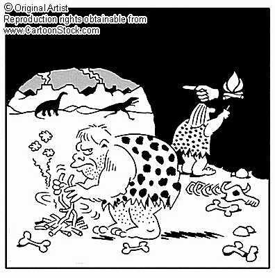
Couldn't resist this! ;)


From www.cartoonstock.com (click the image for the link)From www.cartoonstock.com (click the image for the link).


Icons and Grammar


more to follow soon…

Tuesday, 7 August 2007

Learning Icon™ - Why an Icon?

A Warm Up


This week, a great friend of mine who still allows me to speak of Learning Icons™ took a meaningful breath and leaned across from his comfortable chair over our tea and toast. With a concerned and sincere look on his face he quietly asked, “Why icons?”


I realised that I have not really explained that in this blog although I do have many great references regarding visualizations in learning (see Google; it’s about the only search string that turned up trumps).


Now, I know there may some disadvantages listed for icons, but I can’t help but notice these disadvantages are very pertinent to icons appearing in your software menu bars but I believe the same cannot apply solidly to an icon that performs a higher function than denoting a button. “Press me here” just doesn’t cut it along side a “check out this concept” Learning Icon™. So I’ll stick to the positives while blogging in here, if you don’t mind. If you want some icon bashing try out the “Problems With Icons” dit at this link. But do remember the function of the Learning Icon™ really is different.


There’s loads of great information out there on semiotics (the science of signs and symbols), syntax, linguistics, design, visualization etc., but I don’t want to bore you with references and research here on this page.


My aim is to help you to understand, or to refresh your opinion, that icons can be used in learning because it’s logical, natural, and all round a great idea and that common preconceptions of icons being only virtual buttons on a screen are worth only second-hand pants*.


Back to Icons Being Great


Icons are present not only in our everyday graphics user interface (GUI) such as the MS Windows operating system, Web pages, or other software, but all around us in advertising, on domestic appliances, in our cars, on the back of coaches, on service station signs, in airports, railway and bus stations, in the back of the settee (!!!), and in far more places than I care to list because my fingers are tired already.


Icons convey meaning easily. Verbs are difficult to get right it seems, but nouns seem easy. Icons also work across culture and language to some degree, though without care in design there may be confusion out of context.


Icons can also be placed in sequences to convey wider meaning and, like English words; their meaning can change subtly according to their text or syntax. [Intended IMAGE (gents sign and sign for a man) – as in people carried in a lift].


Also, in the case of people with learning differences or other cognitive reasons why reading text can be difficult icons can be easier to interpret or learn. Words can change meaning within sentances according to their text or context, but icons can more readily change their meaning by changing their shape, colour, or other style signature.


Icons can save space where text could otherwise eat it up and in repeated appearances icons are more acceptable than repeated words or sentences where we get so hung up on grammar rules we can’t always sit easily when the rules appear to have been broken. (How many times have you read “had had” in a book and had to re-read it to ensure the meaning was correct?)


Icons are visualizations, which are used in everyday life including education and advertising. Both areas affect the way we behave or think – a great advantage to girls shopping or still studying (don’t get all PC-uppity, there’s good research to suggest women are advantaged over men in these skills, o who’s to say it’s not due to a better reception to visualization?), which must prove something.


Of course, like visualizations, icons can date quickly. A common example from reading is the floppy-diskette GUI icon denoting, “to save” a file. I can’t use floppies at work and some of my younger colleagues (I’m sure) giggle coyly or snigger in a demeaning fashion as I pull out or even mention a floppy di… See? You’re off on that already. Similarly, if we were using Learning Icons™ in eLearning, icons will need to be kept up to date with the course content, overall presentation style, etc.


Icons are also easy to operate if they are interactive. They can have roll-over effects applied to them and they can be dragged and dropped around the screen in formative and summative assessment or in simple “copy me” activities, etc.


Good, or well-designed icons may even be easy to recall from memory. We are made in a way that allows almost instant recognition of outlines, colours, and key shapes because we used to need to rapidly know if the shape in the bushes was something we wanted to run after or run away from. A delay in either choice could spell out either hunger or supper for either party.


Icons and their component symbols can be concatenated within sequences, algorithms, or other ontological layout structure.


The speed of recognition of well-rehearsed icons can even speed up the signalling of instructions to people. Try explaining the workings of a washing machine to a bloke! No, you’re right forget it. Just add a couple of simple-to-workout icons on the dial and off he goes proudly wagging his tail because he finally got something right – if he didn’t mix the colours with the sensitive whites…


You don’t Believe Me? Try and Example


Seriously, paint the following onto a large board and flash it in front of a large executive car as it is driven down the motorway, “Slow down, there’s a road-rozzer around the corner flashing lazers at those exceeding the speed limit”. The car is travelling very fast.


This particular type of car will likely be in the middle lane and being a pedestrian on a motorway can earn you as many points as speeding, so let’s keep this in our heads now, okay? Anyway, if the text is large enough for Mr BMW-driver to read it he’ll either misinterpret the message, ignore the message and cuss you for being a pedestrian (“humf. Bad enough in the bloomin’ city, never mind on my motorways”), or take so long trying to read the thing and then work out what it means he’d be long past the road-rozzer before, behind a furrowed brow would come an expletive used after the watershed on Channel 4.


Next, use an image. There’s an example alongside here. In case it doesn’t load for technical reasons or because you still have dial-up it’s a speed-trap lazer. Now you know what it represents you’ll probably critique it as being totally crap, but at least if you saw it in another page of this blog you’d like as not recognise it? Well, Mr BMW driver would be 90% certain to misunderstand this, or ignore it if he couldn’t work it out in the context of the motorway and his excessive speed, or he can just make out the outline of a panda car down the tarmac. Not much good, this icon, then?


Ah-ha, I say. How about the one here? It’s words. It uses (UK) motorway sign colouring of blue with white surround making it attractive as an official sign. It’s written in similar white font, too. I reckon it’d work well. If you don’t agree, how about the one below. It’s got a red surround and cautionary yellow background or field with black contrasting font. They are the same words.


I’d hope you’d agree that one of the last two signs is likely more effective than a great speech-representative text?


Punch Line


So, are the text signs still icons? Why not? Are words and letters not just symbols, too? What’s the point here, then? I think it’s that I’m asking you to re-open your mind on what an icon is like my friend who asked, “Why icons?”


I hope you’ll have repeated my friend’s, “Ah, I see.”


Summary


Icons are great at imparting information and can easily be employed in learning as visualizations and as Learning Object-style devices in the form of Learning Icons™.


Icons don’t have to be full of symbols or made of complex images suited to larger thumbnails (becoming all the rage) but can be text-based, too.


Icons can be used in sequences to form a wider meaning.


Footnotes


*For International visitors. Pants are not trousers or leggings, strides, or Jeans but underwear. I refer, of course to soiled pants worn throughout a hot Summer’s day after a night on a curry following drinking water from a dodgy tap or fawcet / faucet, or drinking far too much real ale**).


**”If you feel the bottom is dropping out of your World, drink real ale and feel the World dropping out of your bottom***”.


***(USA) “Ass”. But then the joke’s not so funny, which is why Brits think the Yanks have no sense of humour. It’s unfair, I know, but the evidence is plain to see.

Sunday, 29 July 2007

Cloud Watching

Have you ever stared at the clouds and seen faces, scenes, or other recognisable patterns in them? Perhaps you’ve had a go at ink-blots (Rorschach Inkblots)and had your psyche judged on the weirdness of the result?


The best willed Search results in a load of hocus-pocus around why we see what we believe we see in ink blots and clouds, towels hanging on the back of a door in the dark, etc., but there are proper foundations in the science of perception that allow us to rationalise our brain's desire to see what may not be there.


Think of a “first look, first kill” philosophy of fighter jets; then, on reaching a shared understanding with me, imagine an early human-type thinking they’ve just seen a leopard (or Sabre-Toothed tiger!!). “I think I just saw a puddy-cat”, as Tweety would claim. If this first impression, the initial perception was ignored the true encounter with the predating beast could be quite short-lived and end in a smelly deposit of cat pooh. However, if the early person-type took flight it may:

    1. Escape predation.
    2. Flush out said predator and make an informed decision to scarper.


So, perhaps we are attuned to rapid perception. It may have been a necessity. It still is, in reality. Taken in the broader spectrum of semiotics our rapid and correct interpretation of a look flashed across our lover’s or boss’ face might make a huge difference in our stress level for the remains of the day – or your married life. When driving, our recognition of hazards (whether advertised by signs or interpreted through experience or the environmental changes) is essential to our safe progression at the National speed limit. We learn to recognise some signs (signs in the broadest sense) and we instantly perceive threat (or stimuli) from others.


Applied to the design of icons for graphic user interfaces (GUI) the anticipation of what might be perceived as a way-marker, warning, or enticement must make the resulting graphics more successful in their rapid cognition and correct interpretation?


So, cloud watching is a good illustration of why we need careful design of out Learning Icons™ but not a cause of it. Cloud watching our GUI and Learning Icons™ will lead to a mix of interpretations and the idea is that they lead to only one concise meaning – unless they are context sensitive, in which case they still need to be concise but in their relevant setting or syntax.


If we consider that there are people for whom the recognition of a sequence of letters interspaced as words with individual and grouped meaning dependent on the context or text of their use then we can assume these people will be slower to cognate copy (text, print, writing, etc.) than the average or gifted reader. This group of people used to be considered to be a minority only because the majority of them dropped out of school into menial labour when compared to those with good reading and writing ability who went on to buy expensive houses in posh cul-de-sacs where the poorer-achieving majority were seldom seen (except on Tuesdays to take away the rubbish – but the interaction was pretty poor considering our achievers were either at work or still in bed on a day off, following a night shift, or when playing hooky ready for BBC2’s Wimbledon coverage).


I digress. Anyway, imagine we can appeal to these poorer reader’s sense of survival by providing icons that are deliberately designed to be either recognised easily – or learned to be recognised easily: to be quickly cognated? The problem is determining what will work best: simple uncomplicated iconic forms, or indexical pictograms? Do we propose what will work, or do we consult with the users and test the results until we either reach our Pot-Noodle (tasteless, maybe, but hugely successful, according to Ben Elton in, “Air”) or mediate a solution for most of the people most of the time?


This project is to explore the foundations of the creation of icons for learning, Learning Icons™. The icons need to be useful. They need to be placed in sequences, to have individual as well as group meaning that may change according to context or ‘text’. Their GUI design needs to be intuitive and fit to purpose across a range of users or within a specified range of users. There will not be a single Learning Icon™ design, I’m sure. There will be variety according to the need and ability of the user, the intention of the learning provider, and the fashions of design abound at the time of their development.


Let’s not forget, although some navigational GUI icons have been sustained for some 20-odd years, their actual appearance has changed quite dramatically. Yes, we had clothes 20-years ago, but our clothes are still clothes, as icons are still icons, but the technology behind textiles as well as GUI design has moved on along with our and commerce’s preferences, or fashion.


I tried a clothing analogy and chose not to use it originally as many of our clothing fashions are returning to their routes of the past as fresh ideas of how to cover our essential bits (or to accentuate them) continue to allude our designers. I also tried cars: same problem – although there are more bells and whistles and choices of trim and additional-cost technologies, they tend to still have 4-wheels (yes, 5 with the steering wheel) and a body shell, which although ‘modern’ is increasingly reliant on car shapes from the past – or the desire to have personal rocket cars in the garage during the 50’s and 60’s (1st Ford Cortinas and Consuls).


So too with icons. You don’t like my icon design today? Maybe, just maybe you will love them in 10-years’ time?


I bring this fashion point up because of my own challenged prejudices. I like uncluttered simple icon designs, so clever they work. They may take a furrowed brow at first, but once informed of their specific meaning in that specific context or ‘text’ you’ll go, “oh, yeah!” The fashion (thanks to greater processing power) is to have larger and more elaborate and, in the case of Microsoft Vista icon, beautiful pictograms: even user-activated animated or video-shoe-horned multi-media devices. Gorgeous.


I am therefore doggedly following my own preference in the visual design of my prototype Learning Icons™. It doesn’t really matter if they work; if the user agrees they mean what they should and seldom mean what they shouldn’t.


A caution though. I developed two icons to mean one or two rescuers (first aiders). I lived with them throughout their initial design and user-testing and loved them. On showing them to two new observers last week, one (Simon, you git) said, “I know what that one is before you tell me, Pat. It’s an ‘i’ for ‘information’.” I looked down at my paper model of a Learning Icon™ that could be used in a face-to-face learning environment, all beautifully crafted, colourfully printed, and diligently cut out to stand up on its own, icon to its face and textual explanation of its meaning and context within. He was right. It was not a stylized body with a head deliberately disembodied, but it was an ‘i’ for ‘information’.


What was interesting was that the single-person / rescuer icon had been derived from the 2-rescuer and multiple rescuer icons developed earlier. I had missed something through my own clouded perception formed from habit over only a matter of minutes. I had learned what the "i" had meant as representing a person and accepted the single "i" as such, completely ignoring my culteral learning to see it as the "i" of information.


No matter how clever you think you are at this game (and I am getting to be clever) I think that, while the meaning of an intended icon design is pre-ordained by the matter of its being designed to denote an aspect of the user’s learning, it will seldom mean the same thing to everyone all of the time. This results in three findings (a good ol' traditional semiotic triad):

    1. Icons should be labelled (at least when first encountered)
    2. Icons need to link to a glossary.
    3. Icons will still never mean exactly what you want until you explain what they mean.


You have a furrowed brow, my casual lay-reader. And you, the experts! You're nodding knowingly, I can tell.


Here’s an example. Think of the sign for a male toilet (not a toilet with a willy, but a toilet, ablution, or washroom designed for gentlemen and esquires to empty their bladders and bowls in – into toilets, not onto the floor, at least outside London and Glasgow).


The sign you will think of in the UK, and across much of the World will be of a symbol for a man; a bloke. It may have additional attire such as lederhosen or a Trilby hat, but it’ll essentially be a bloke.


What’s it actually mean? It means, “man”. A girlie one with a skirt/dress would mean, “woman”. Male or female. Yet, in these days of open sexuality and hedonistic desires to express cross-gender freedoms or to avoid fungal infections between testicles and thighs, neither sign can actually be relied upon to represent the silhouetted shape of a man or woman anymore. That aside, (a sigh from the most Politically Correct among you) is the fact that the symbols do not indexically represent a toilet or urinal. They have been learned to represent the appropriate washroom / toilet to use according to our society’s current understanding of a gender type-cast.


My argument? The design of icons is, perhaps, less important than we think. Perhaps, in the same way we recognise a dress, car, or toilet door sign, the icon will need to be learned at some point in our educational journey through time and space. Then the challenge is to make that learning process as efficient as we can so as to avoid overly burdening our busy learner with learning anything much more complicated than the subject they’ve chosen to study in the first place.


This is my argument for simple, clear, and concise use of shapes in the icon design. You may differ; you may illustrate to me how wrong I might be. At this moment though, I am content this is the immediate solution to staying on track with my exploration of the Learning Icon™ as a learning device in eLearning as well as in the classroom. I don’t want to be overly-burdened with any more on the aesthetic design, but only now on the cognitive and GUI design of the icons.


Prettier icons can be left to the graphicist professionals. May I be one, one day, too.